Alpenglow Design Process
4. From Wireframes to Illustrations
What is arguably just as fun as designing the mechanics of the game is crafting the art and components to make a great first impression yet be easy to play with and enjoy.
Any ideas for the game art? That was a very common question as we played the game and introduced it to friends and family. We had tons of ideas but really pushed the art to the back burner as long as we could.
Bigger questions came to mind for us. Although my wife and I both have strong design backgrounds, did we want to illustrate the game or bring in some friends? What would the style be? Well we didn't know until we sat down and decided it was time to pick something and just start.
The initial wireframe style elements really felt nice as we played the game for much of a year. While it was on and off, we focused on mechanics and flow more than art but it wasn't until I had an abundance of time with a newborn that I took a stab at illustrations.
Picking a Style
We had a small collection of graphics that we were pretty excited about but that is a far cry from having art direction. We bounced between some overlapping styles starting with Europe's equivalent of America's WPA posters.
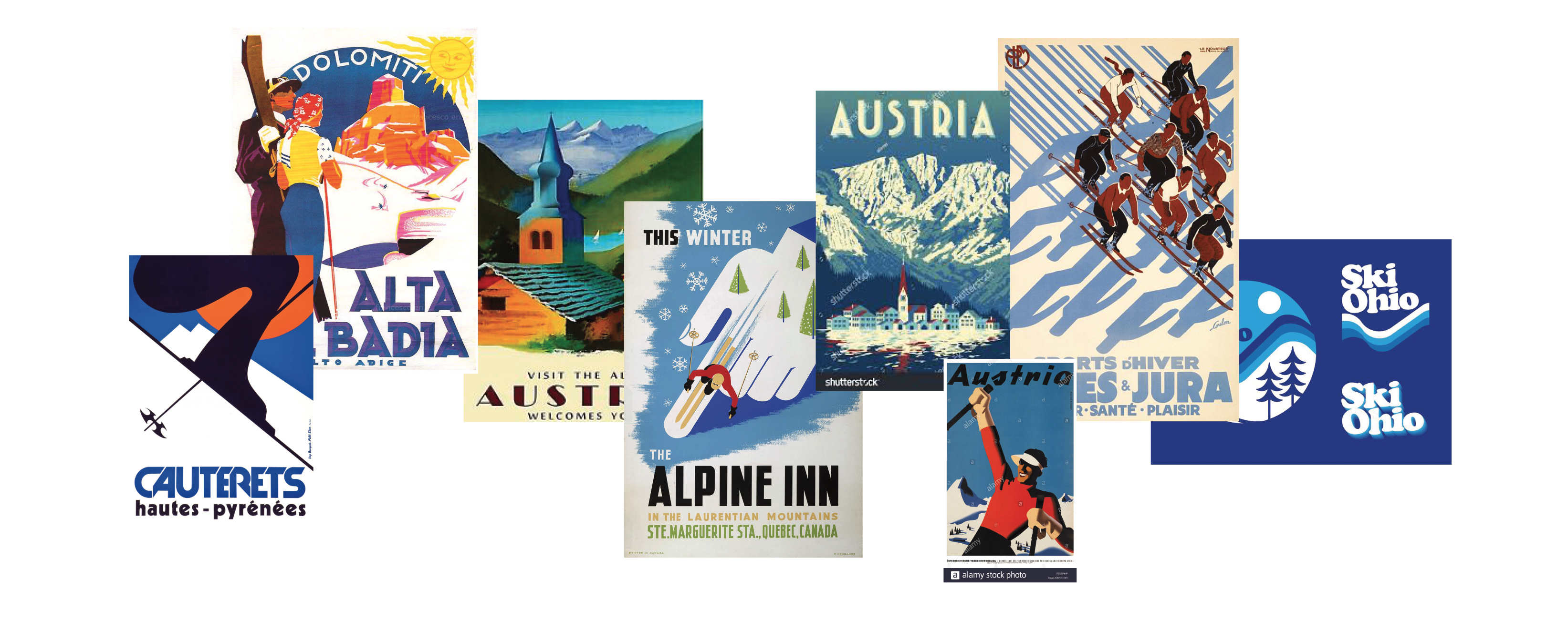
We actually took a very short test down this path and the boldness of the art really coupled with the ski run signs you can find across ski areas in the states. It felt too much and we bailed before even taking a stab at our own illustrations though. Sometimes it's worth the test but being willing to say no is important.
We both loved the styles throughout the eras, all inspiring a sense of adventure and escape. The older painted options leave much to the imagination but the more modern styles of the screen print designs let typography shine. We actually started here and looked for the intersection of posters like these and the bold abstract forms of Italian Futurism movement. A softer approach felt more appropriate and Jillian was imagining something more light and colorful, something akin to Wingspan and the watercolor vignettes they couple with the bird cards. This line of exploration actually landed us with vector art which is in vogue right now. Some games, like Obsession, have crafted their art simply by using the live trace tool in Illustrator but all of our photos from ski trips and travel were too gloomy to pass for a bright and fun game.
Where to Start
The first earnest attempt at putting art to the game happened when I had time off from work after our son was born. I broke out the iPad and started sketching on the board. The first board was bold and pretty fun to craft using nothing more than the built-in Notes app.
I did move to Concepts, an app I love for drawing and sketching, where I went all in with the watercolor approach. It was fun to break out a variety of boards and see how things were laid out, what information belongs on the board vs breaking it out into the rules, player aids, or player boards (at this time, we didn't have a player board yet).
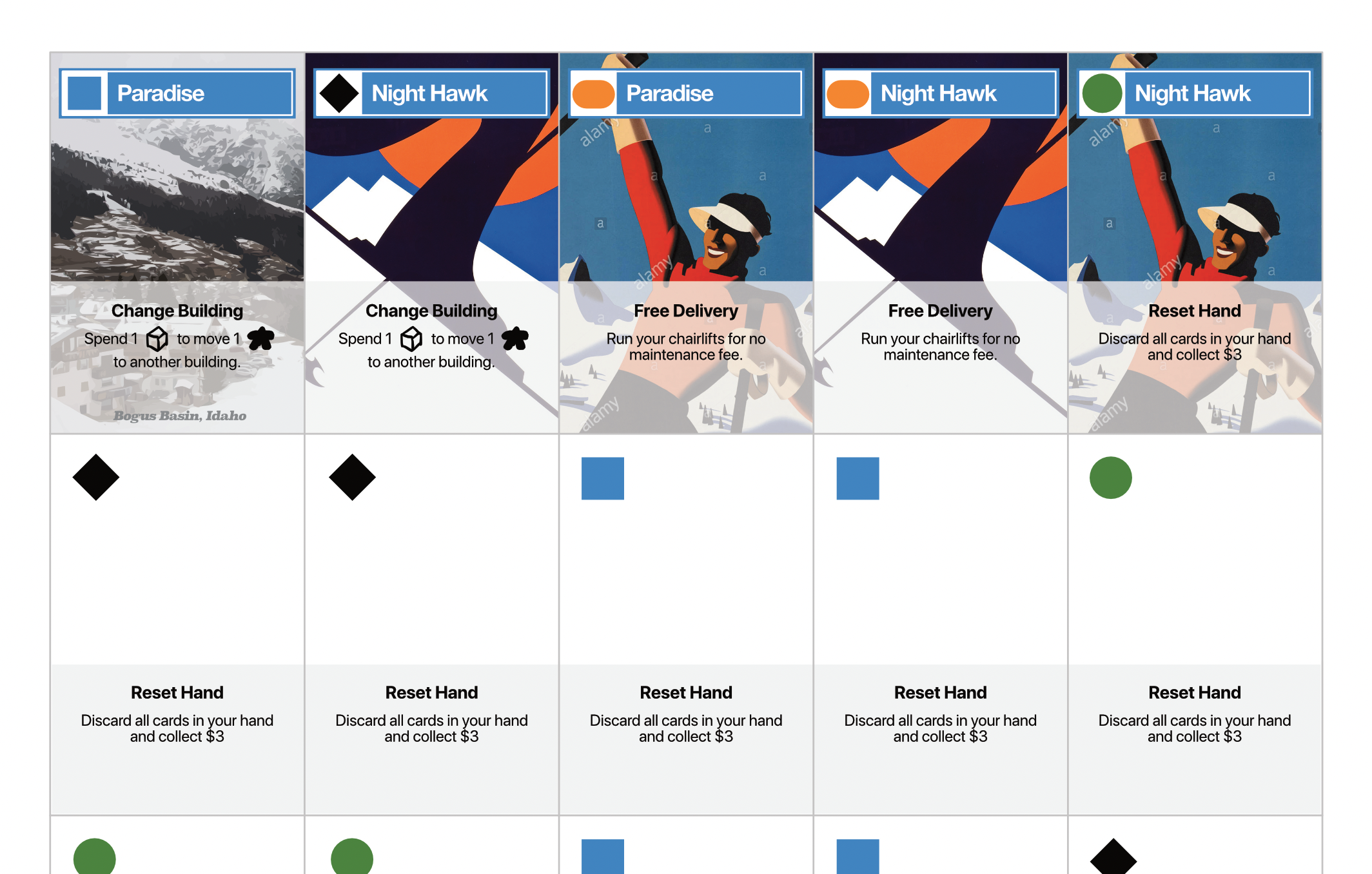
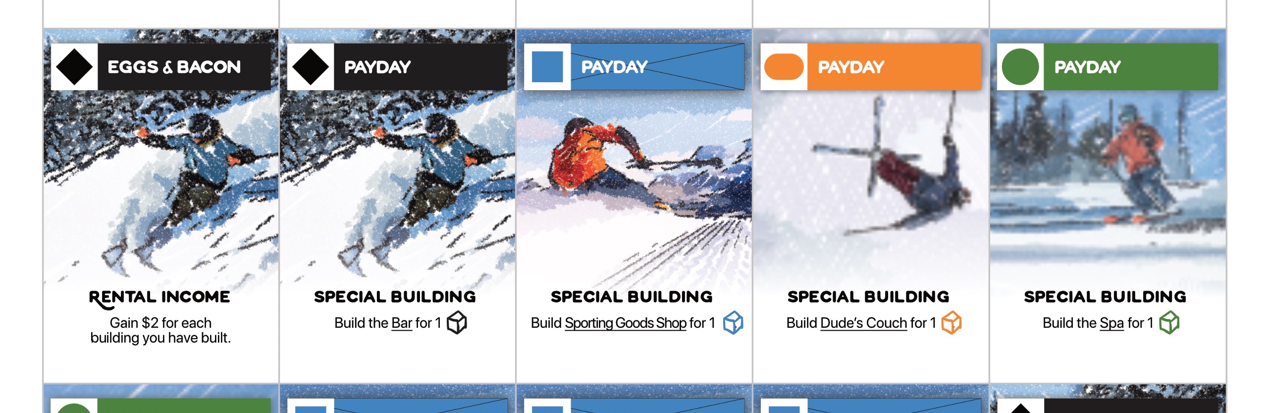
Amazing what a little color does to a wireframe! The first play-test after printing out the new board drew some really positive feedback but all focus shifted to the cards and building tokens. What would they look like? We took the easy approach and found some images from a Creative Commons search and used an AI filter app called SDFX to apply a pencil sketchy look. It was colorful, fresh, and served as great placeholders as we continued to play the game with friends and family.
Buildings and a Directional Shift
We were still struggling with creating a cohesive style although each of the components looked nice on their own. We also had the building tokens that wanted something more and it was not clear how to add art to the buildings in a way that was clear and didn't distract from the icons and values on them.
The game went on ice for a few months as work and the baby filled out the hours of a day. It wasn't until early spring when I was invited to test out MidJourney. I know this is going to be a divisive topic but I was all on board to test out a generative AI for ideation and to develop some placeholders before we started diving into the larger illustrations. My buddy and I scoured the Discord channels looking at example prompts and tested out our own to see where we could strike gold.
The first components that used art from the AI was styled like the Italian Futurism posters we originally loved with a mix of WPA National Park posters. The ability to mix and match styles afforded us an opportunity to really dive in and test out what the game could and should look like. As anyone who was using these tools can attest to, getting quality graphics out is straightforward with patience and a lot of "re-rolls". It's surprising how easy it is to get illustrations but how difficult it is to make them consistent. You literally need to tweak and re-run prompts dozens of times to get images that feel like they are part of a cohesive theme.
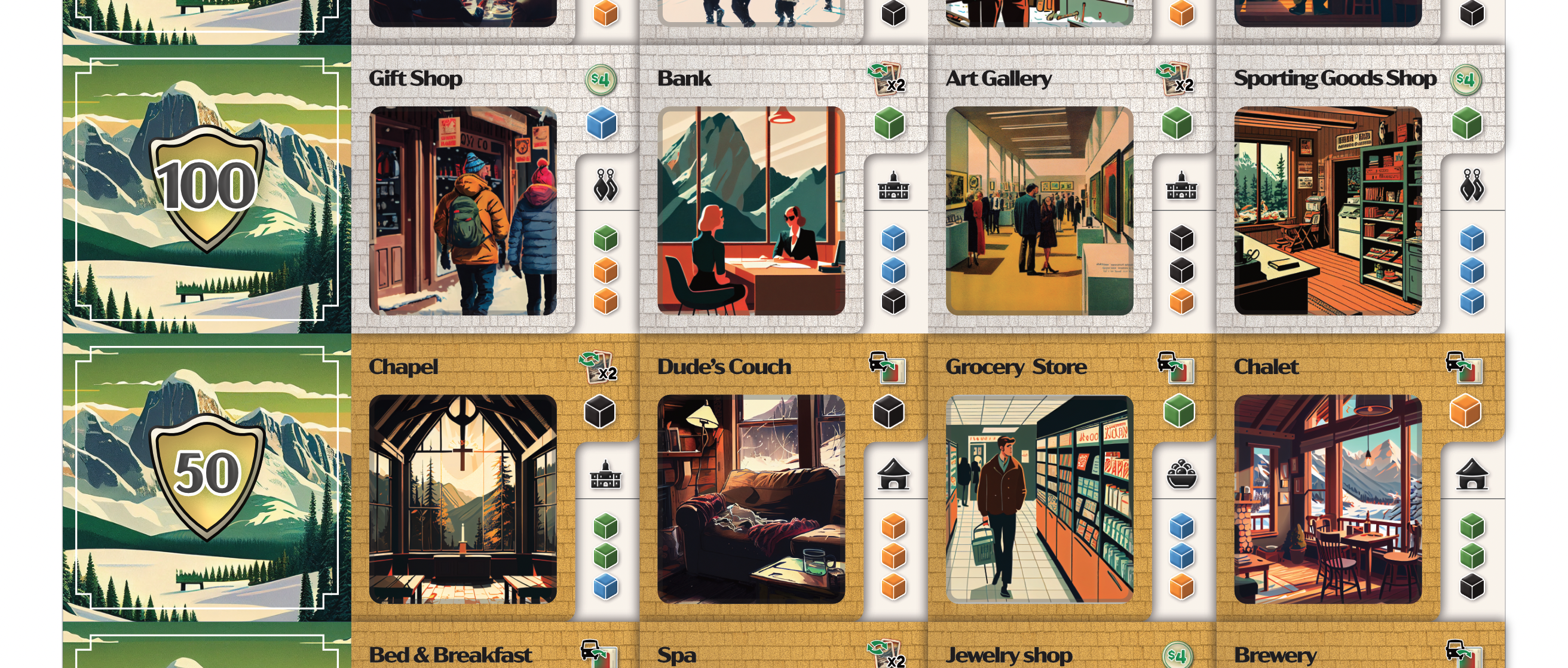
It was time we dove into the illustrations for the buildings. The workflow started with images coming out of MidJourney, then went into Concepts and Affinity Designer where we traced, created a vector graphic, and made edits to our liking. We used this to get our colors more consistent with our overall theme, added texture, reflections, and other relevant additions, and fixed parts of images where the Generative AI models were weak (faces, hands, etc).
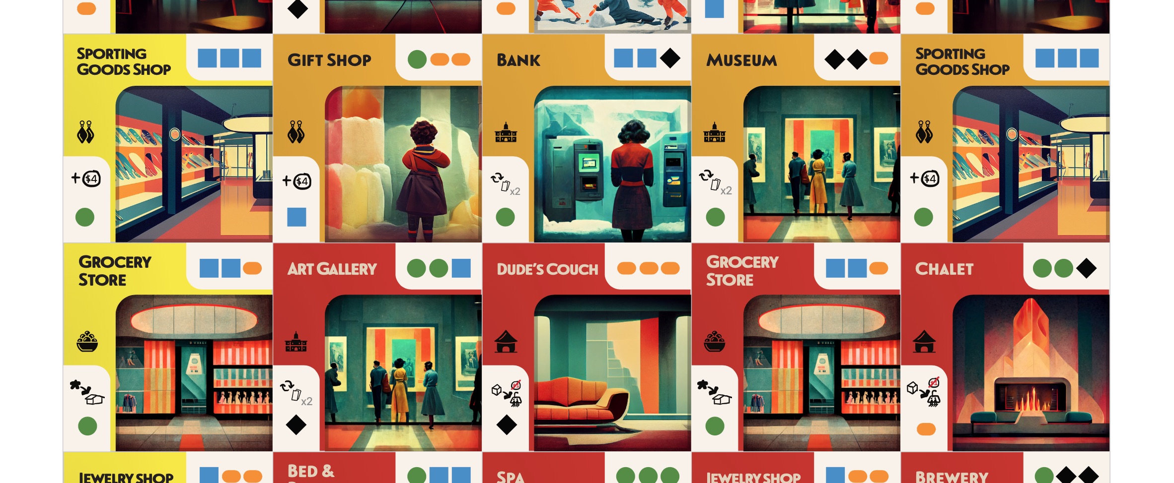
The buildings were first and the art really felt unique and bold. We found ourselves asking if this a direction we liked, something we could take and use as a foundation for our own illustrations? It was a shift into an art deco feel while holding on to that adventurous WPA poster style. After about 1000 images generated and a few weeks of drawing and photoshop work, a collection of buildings was ready for play.
Icons
The hand sketched series of icons had served us well for over a year. Sometimes you don't bother fixing something if it works and that was very much true for us. I was getting excited about the prospects of designing icons though and it was a perfect time since we had new art.
I surveyed some other games we enjoy but really just poked around Affinity Designer until I had a style I liked. I went through all of the actions and elements I could think of and created a nice series of graphics ready for play. It was time to get them integrated into the rest of the components and that was the driver to revisit the parts we haven't touched in a while.
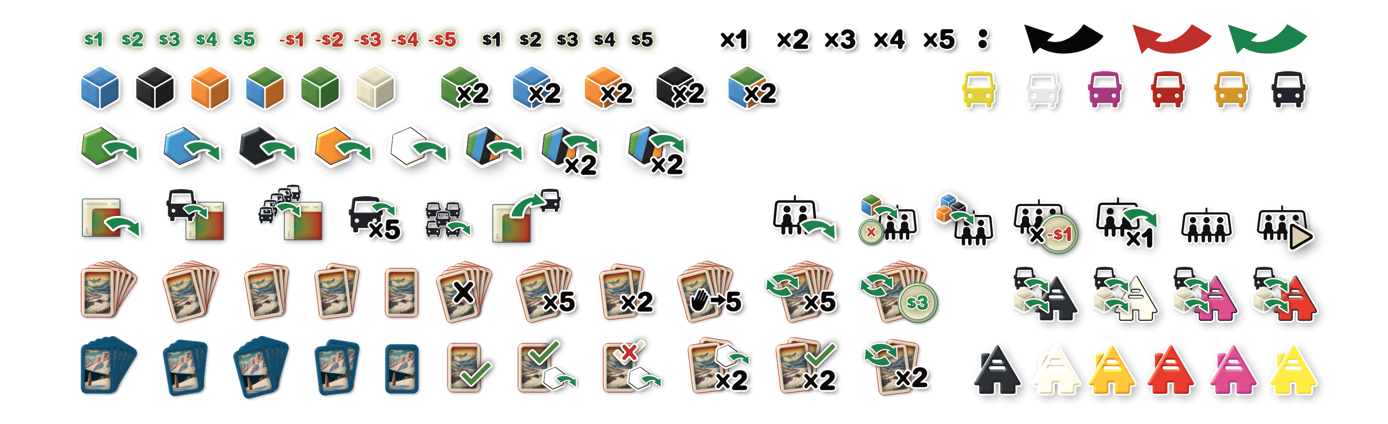
The icons really worked well. Shadows, symbols, and style started to feel consistent and good as they came together but started to question how well it all fit in with our little potpourri of styles of the rest of the art.
A Step Back for a Bigger Step Forward
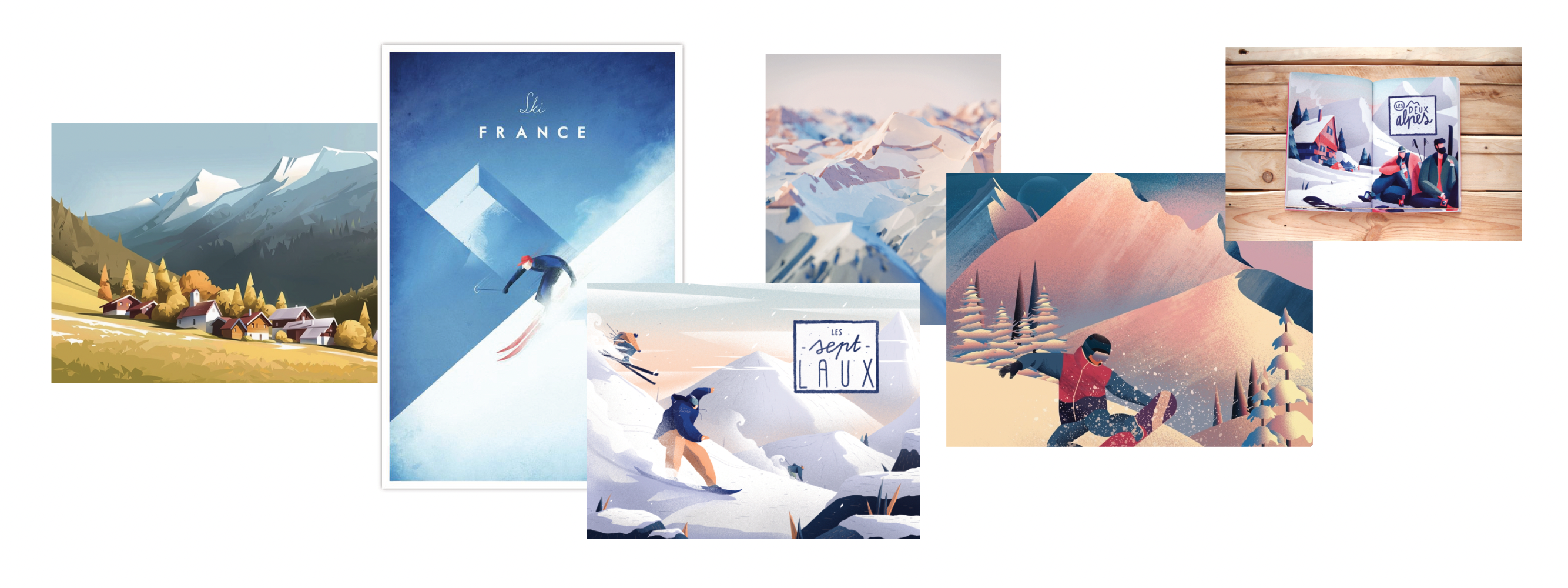
This was the look and feel we had for a while until we took a step back and felt the game needed to shift again. It was too cold, too bold, and a little too dark. A renewed visit to the original mood boards sent us on a new search for art that was more screen print and less art deco noir. We liked the mid century graphics of the jet age advertisements and were being drawn to retrofuturism.
We revisited MidJourney and its newly released v4 model as a starting point for new illustrations and ideation. We changed the workflow and took a heavier hand in illustrating. We took images we generated from the model and brought them into Concepts where we would trace over parts we wanted to use, made changes to layout or composition, add in elements the ski area feel, and then painted and filled the illustration. We'd finally bring it over to Affinity Photo and Designer where we would make changes to color and frame the image for use in game components like buildings or cards.
It was perfect timing to revisit everything actually. Recent play tests provided some feedback and I wanted to focus on consistency. Once the rules and game play has been solid for a while, it was time to optimize and refine.
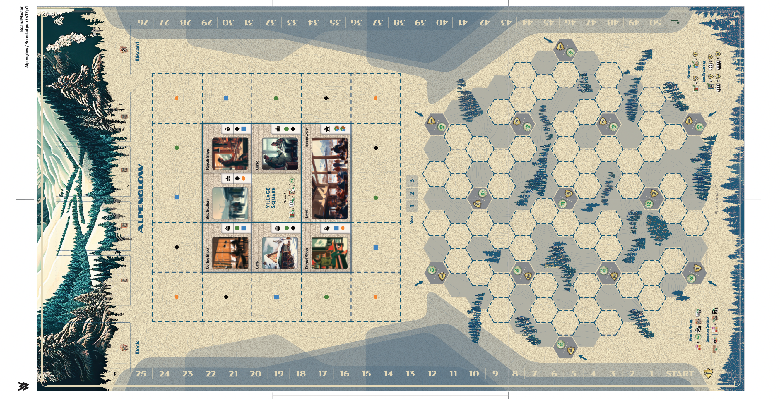
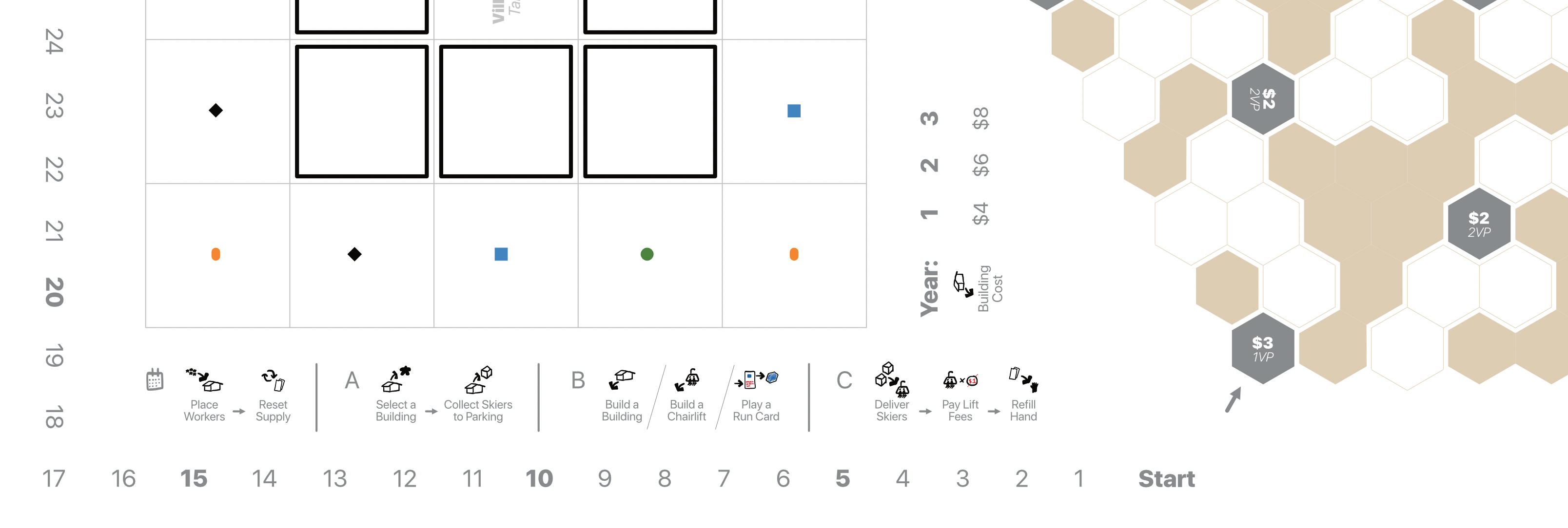
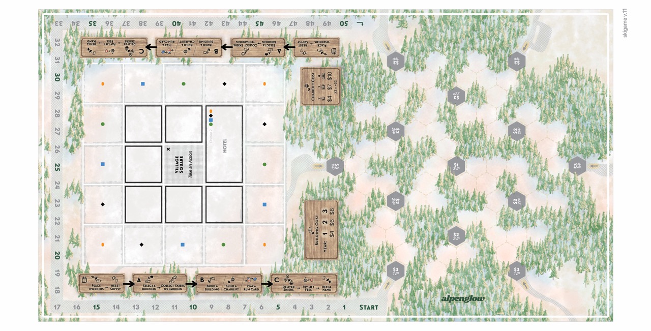
The board and player board both were fun to refine. Adding the paper texture and updated fonts really brought everything in conformance and once everything was printed, version 18 was really feeling like a professionally produced board game you'd pick up from a game store.
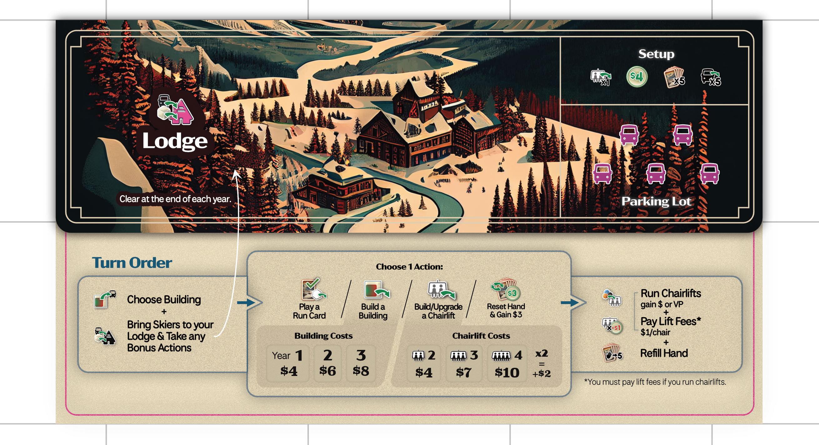
The player board was the pinnacle of the redesign effort because it was my chance to revisit the way the game can visually show players the options they have each turn. Maracaibo has a player aid that is double sided and is quite a lot given the phased nature of turns in the game. I wanted to break from that and make it feel as simple as possible to complete the steps of a turn.
Once we decided we wanted to push the game out and try publishing it ourselves, we chose to dive back into the art. We needed more consistency, we wanted a more playful and bright pallet of colors, and we finally had more time to dedicate to the game.
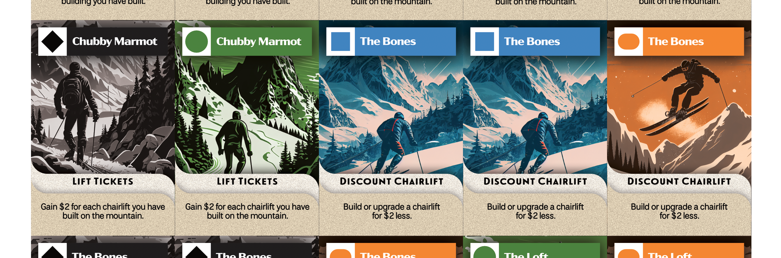
We redrew many of the illustrations replacing the placeholders for almost everything. The board lost it's grunge feel and was rotated. The run cards became brighter and feature ski runs. The buildings have a more vibrant collection if illustrations. Finally, the player boards got the biggest revisit with larger and playful vistas. We liked the illustrations so much we are actually including extra player boards so that we can share the art. The revisit was necessary and let us depart from the previous explorations that came out of MidJourney.
We also revisited the rulebook. In addition to the player board, I prepared a player aid card which lists icons players will encounter accompanied by descriptions. The goal of these two elements is to make gameplay possible without needing to refer to the rule book between turns.
All in all, preparing game art was a year long task that happened in phases. The initial graphics did wonders for the development of the mechanisms and rules and the play tests in the spring and summer both ignited rounds of stylistic improvements that helped lead us to where we are now. There will undoubtably be further revisions but as we approach the big question of how we want to take Alpenglow to market, a full redesign by a professional may happen. If so, I'm sure it will be nothing short of another big step forward for the game. Thanks again for reading and I hope you've enjoyed the visuals!
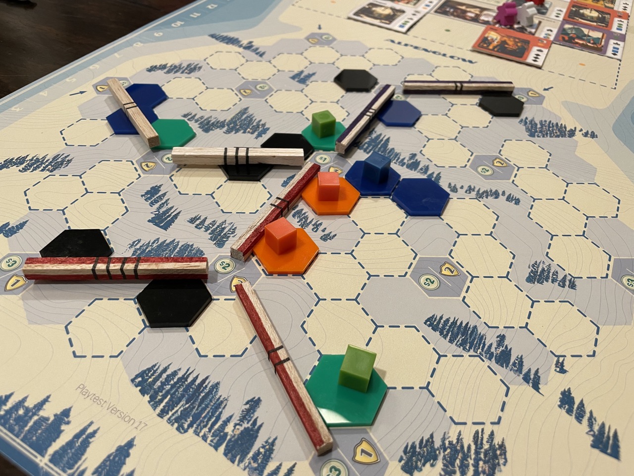
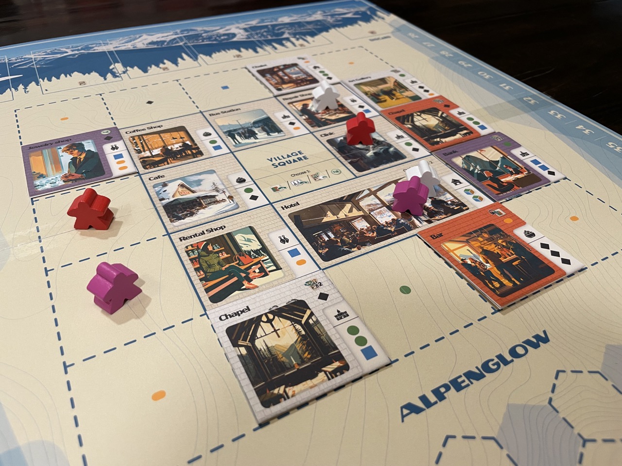
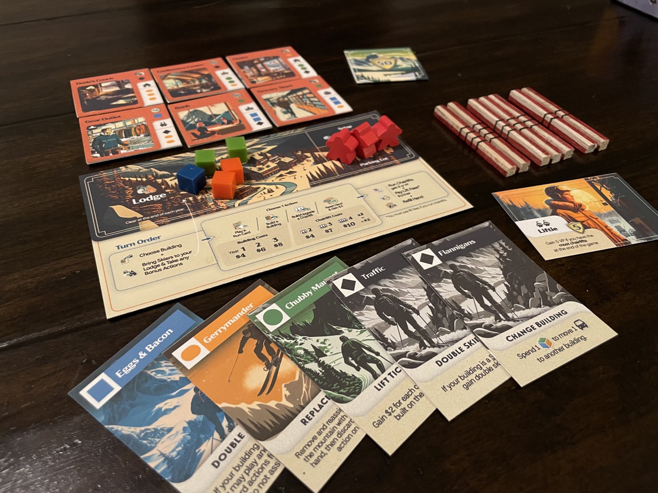
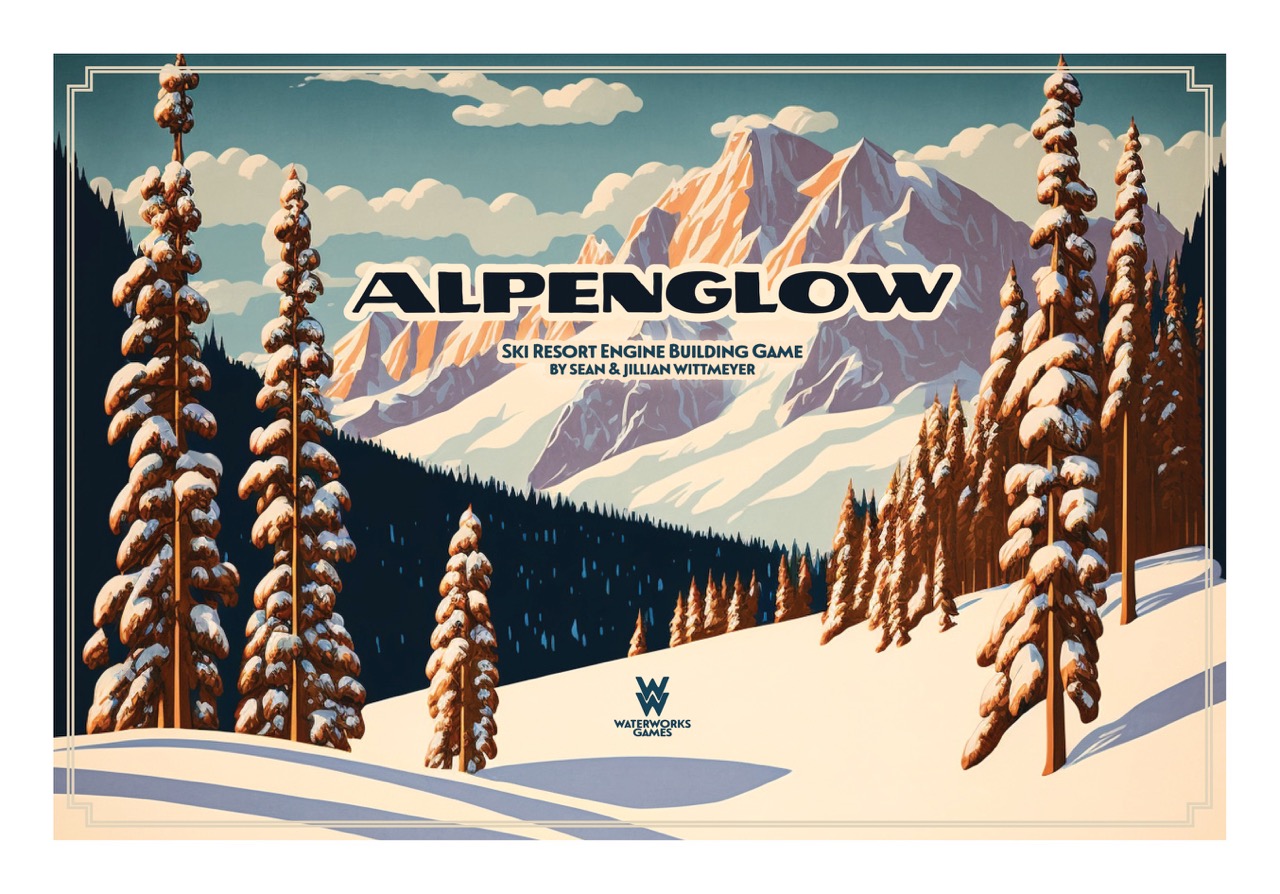
Photo Credit and Caption: Alpenglow Game Board by Sean Wittmeyer
Cite this page:
Wittmeyer, S. (2022, 18 December). 4. From Wireframes to Illustrations. Retrieved from https://seanwittmeyer.com/article/alpenglow-wireframes-illustration
4. From Wireframes to Illustrations was updated December 18th, 2022.